Redesigning a cohesive and modern menu system for a historic non-profit Spanish restaurant in New York City
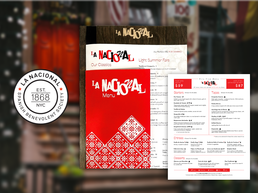
La Nacional Spanish Benevolent Society is the oldest Spanish cultural institution in the United States, with a long history of supporting the Spanish community in New York City.
The restaurant is a non-profit organization that also hosts private events to fund its activities, making both its food offerings and event promotion essential to its mission.
The restaurant’s original menu was an oversized, tabloid-format design that was difficult to handle, hard to read and visually outdated.
Typography, layout, and visual hierarchy were inconsistent, making it challenging for customers to navigate the food and drink offerings. Additionally, there was no clear way to highlight the society’s history or promote its event rental spaces.
Old version of the menu
Create a more manageable, cohesive, and modern menu system that:
The redesign focused on a functional, unified menu system:
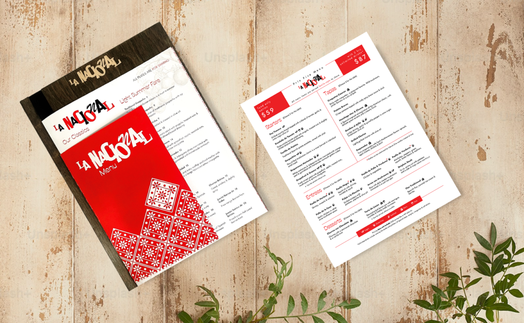
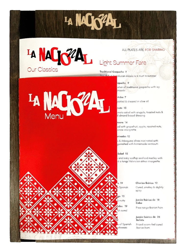
The menu was split into two pieces.
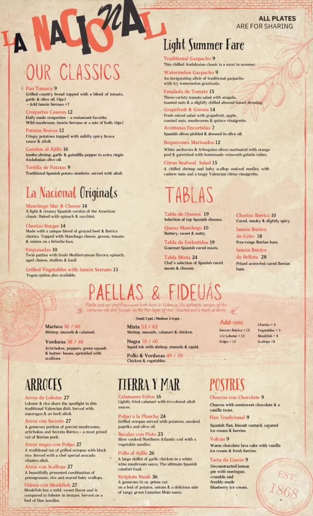
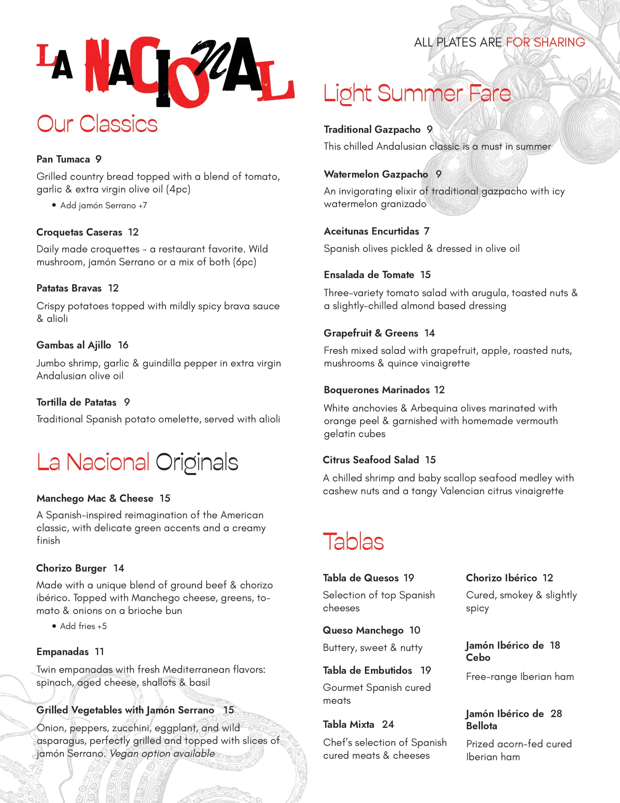
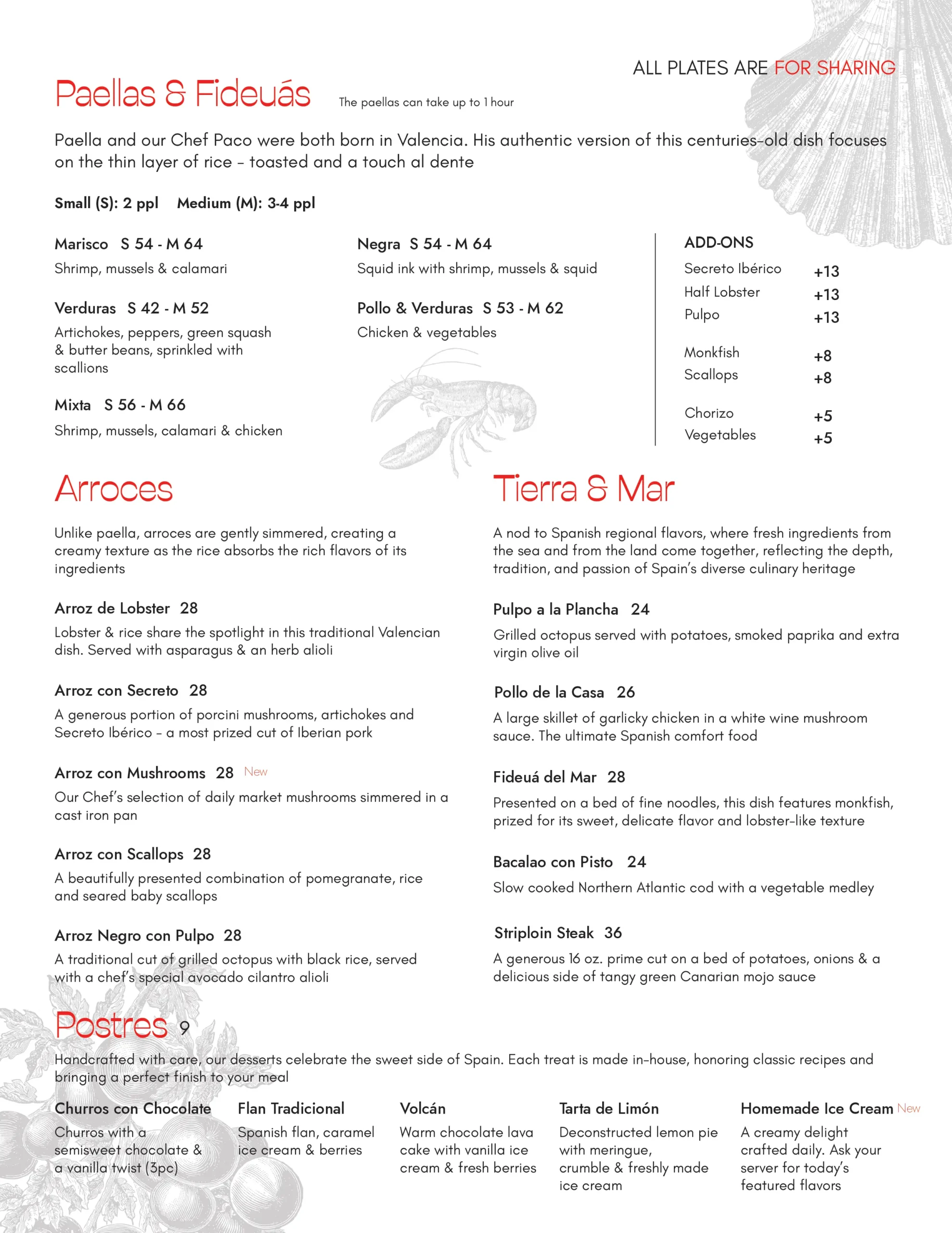
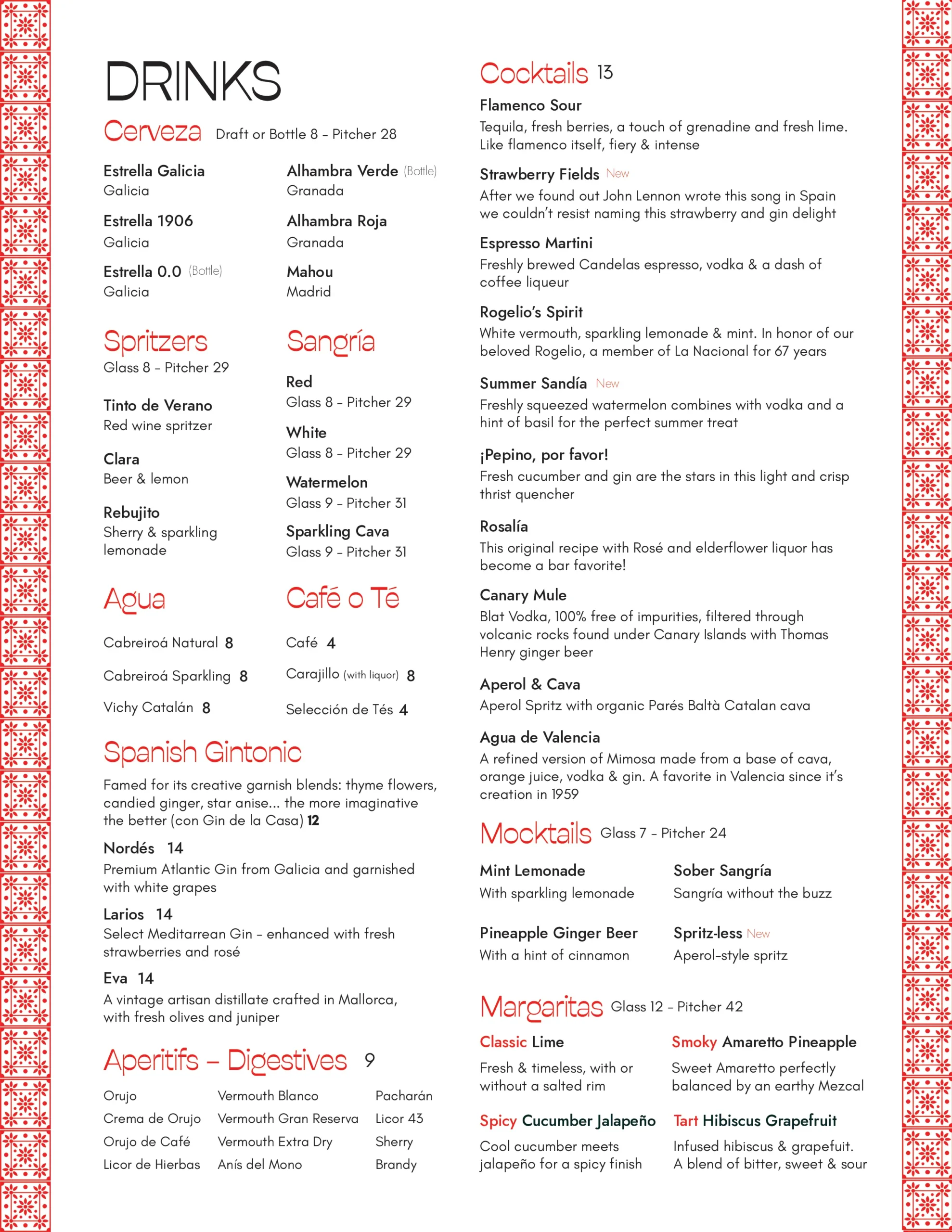
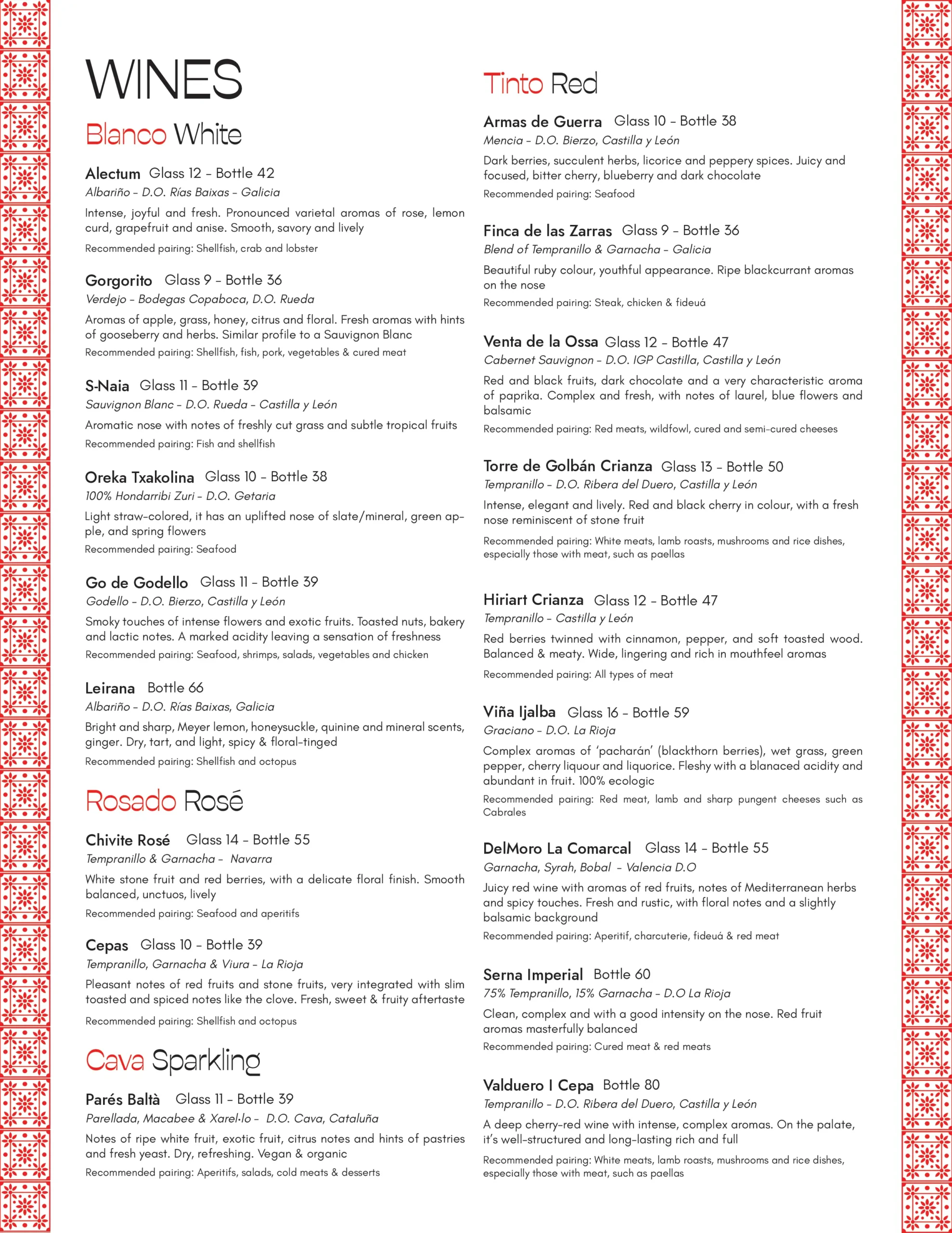
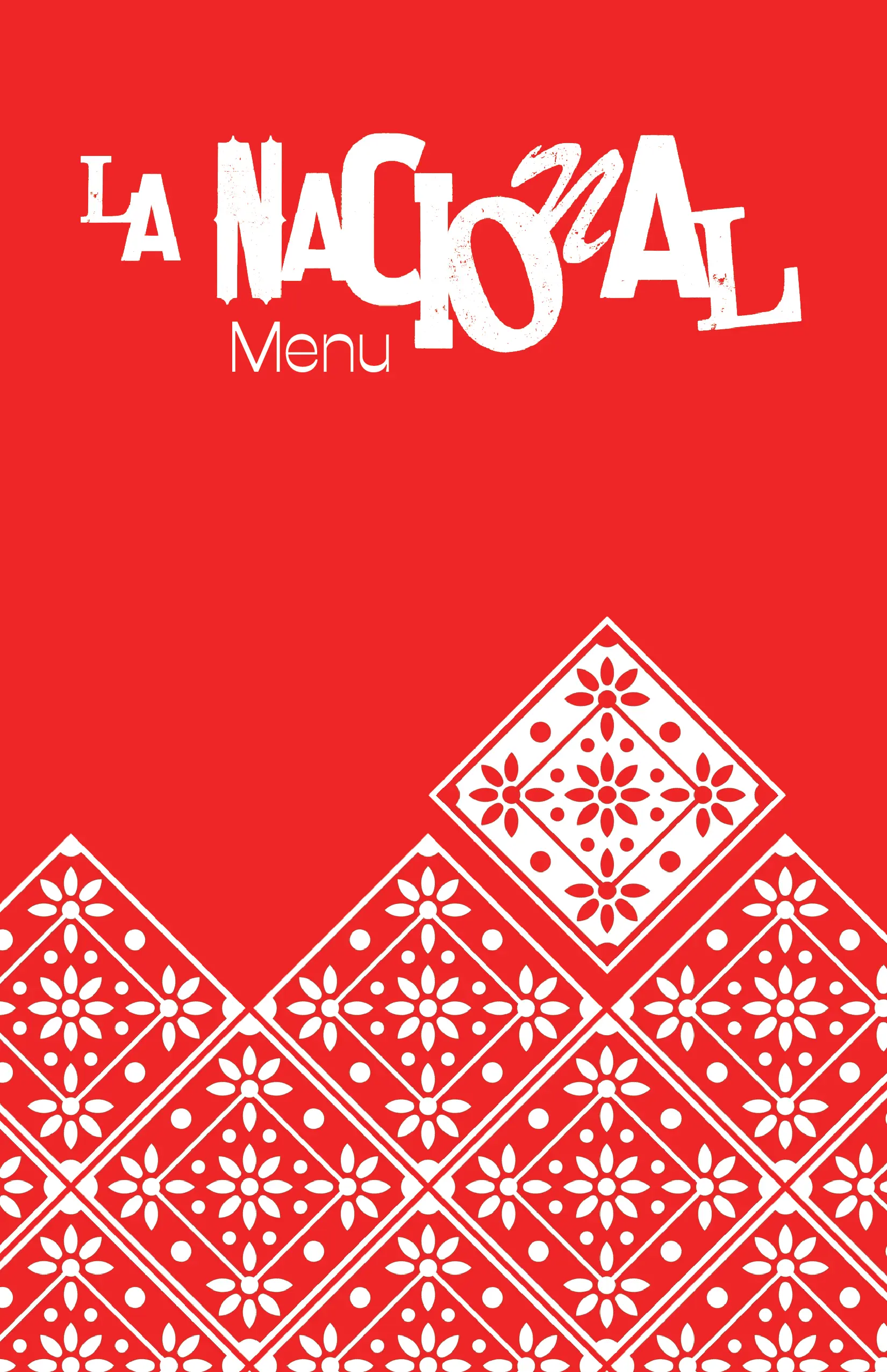
The main menu was scaled down to a letter-size format, making it easier to handle than the original tabloid version and presenting all food and drink offerings organized into clear categories.
The layout was designed to be simple and clean, featuring Mediterranean-inspired motifs while preserving the colors of the original logo.
Main menu redesign
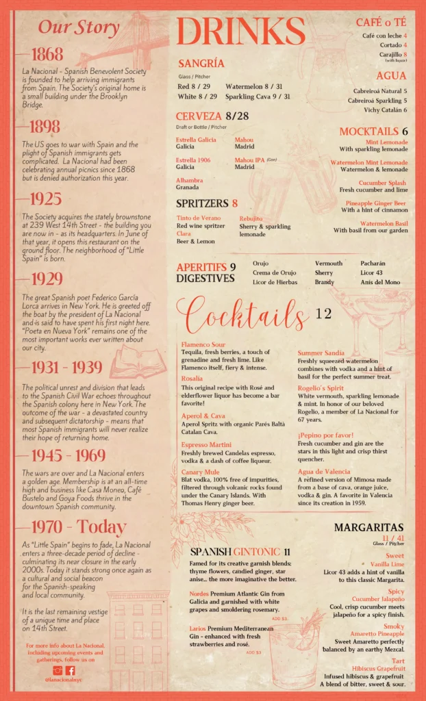
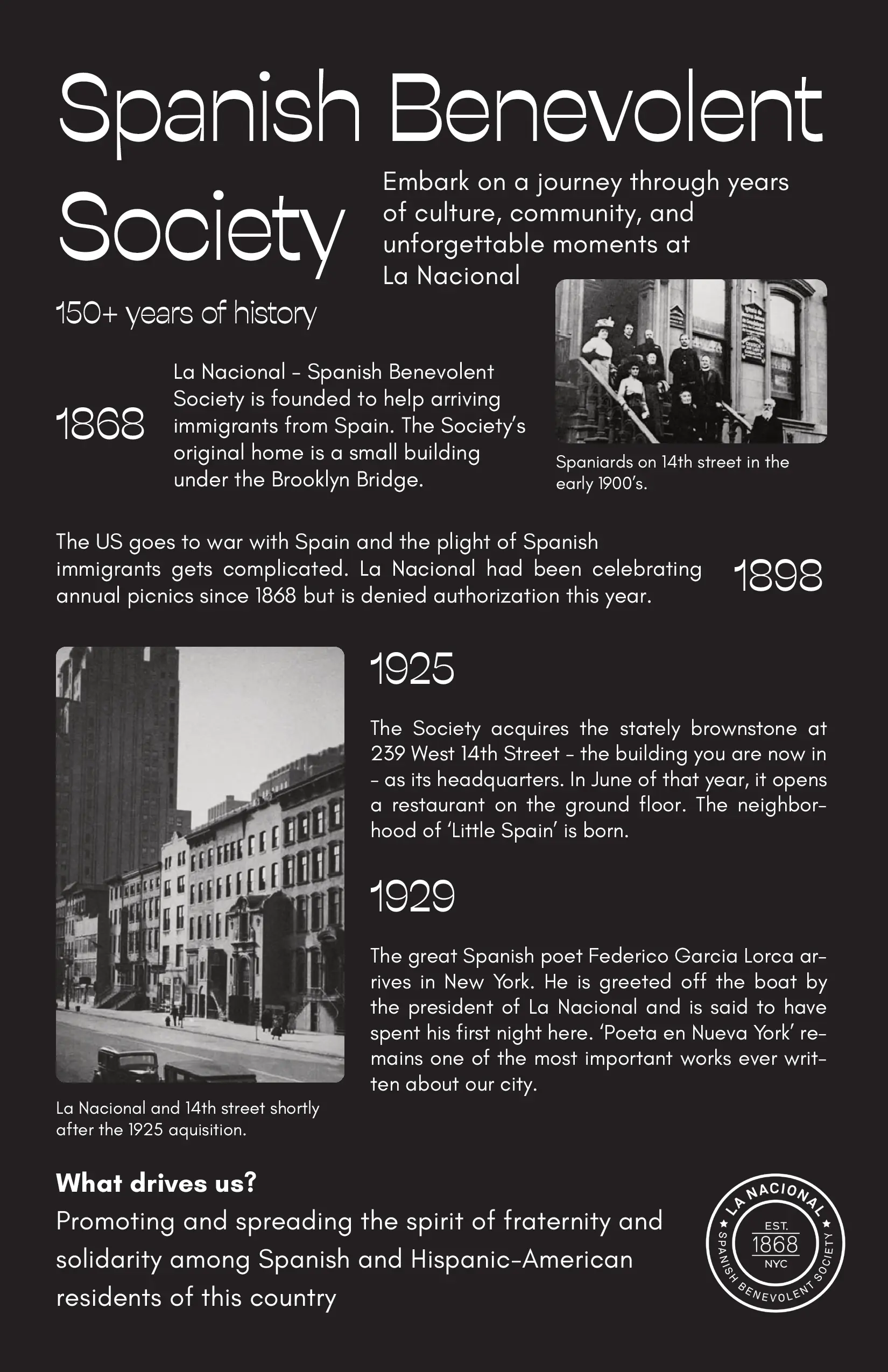
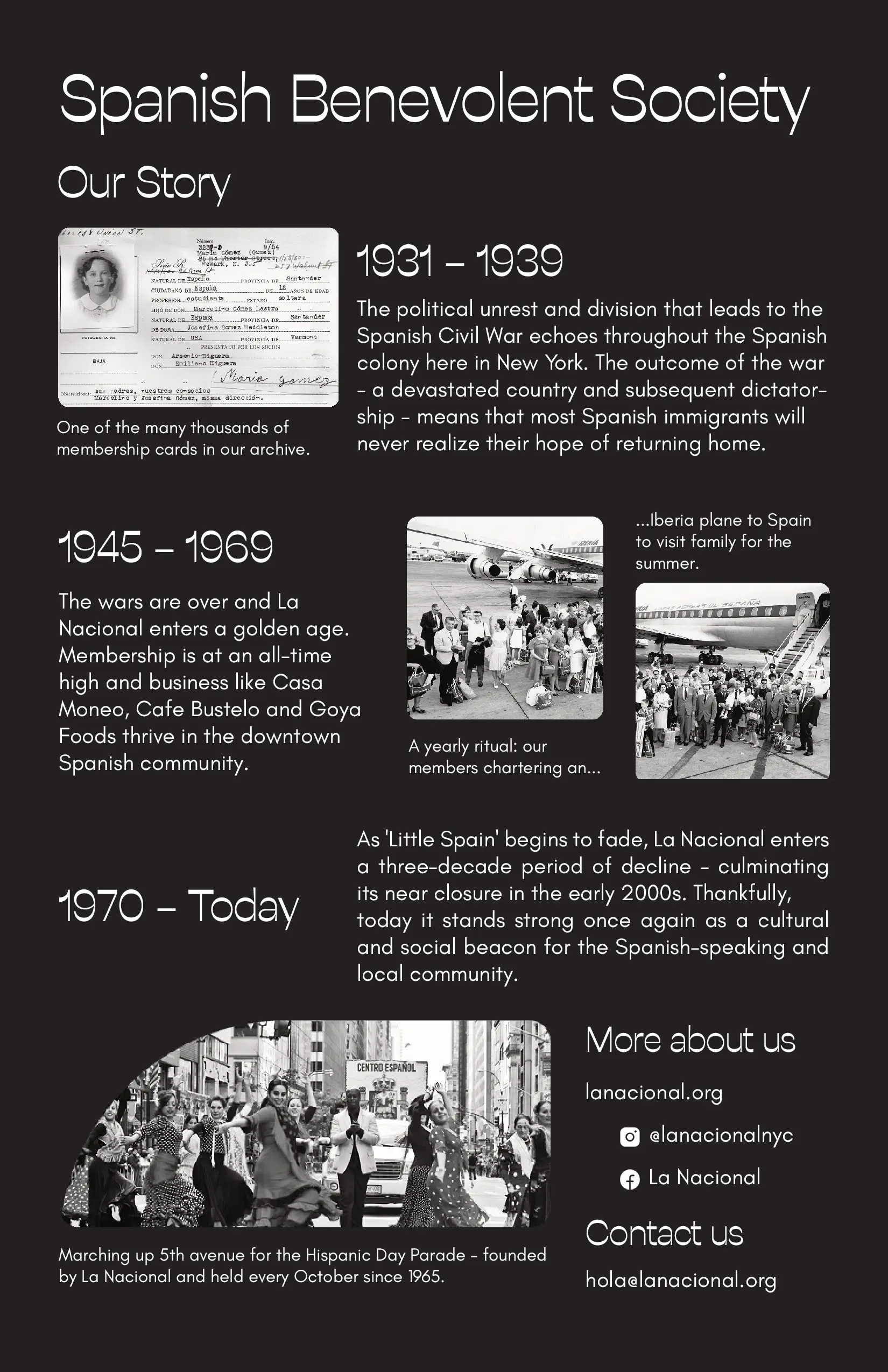
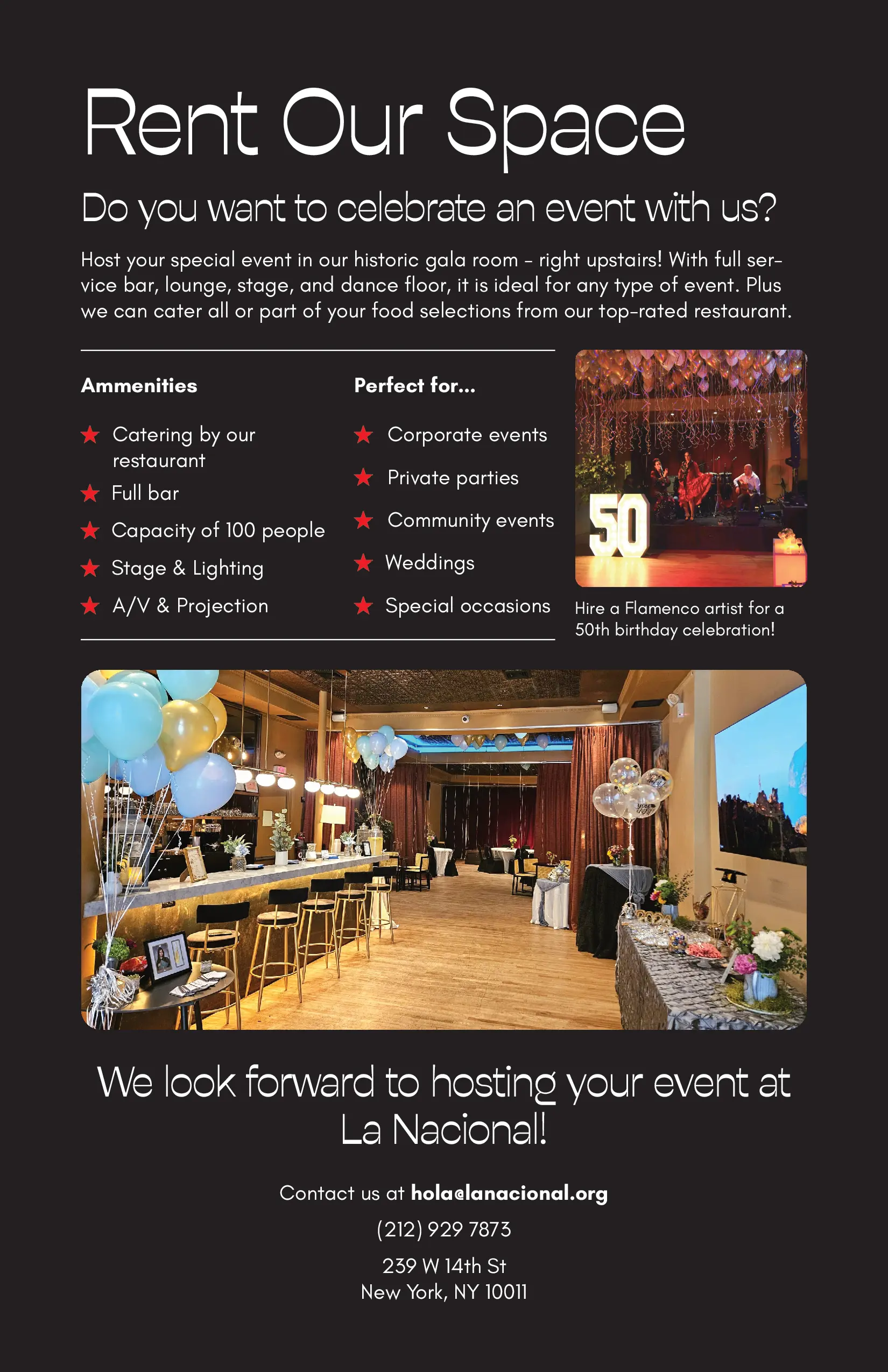
To improve the design and create space for additional content, I introduced a small booklet alongside the main menu. This piece presents the history of the Spanish Benevolent Society and highlights the option to rent the venue for private events: one of the nonprofit’s key sources of funding.
Small booklet design
The redesign focused on a functional, unified menu system:
The Prix Fixe menu is a key part of the restaurant’s service as it is designed for large groups, one of La Nacional’s main types of clients.
As part of the redesign, I adapted the new visual system to the existing Prix Fixe format, updating its typography, layout, and overall style while maintaining the original structure.
This ensured visual coherence with the new menu system while preserving the practicality needed for group dining.
Old version of the Prix Fixe Menu
New version of the Prix Fixe Menu